It began in December 2022, over dinner with a curator-mentor, EJ, whom I deeply respect. There, I was introduced to Director M from JK Mirae, who shared plans to build a new gallery inside the Godeok IPARK The River, a residential-commercial complex. They asked for input on how to best utilize the space for the creatives.
My background spanning museums, alternative spaces, artist studios, fairs, and corporate art ventures seemed finally aligned for a project, so, with genuine excitement, I developed a strategy tailored to the site’s unique characteristics. Given that established galleries may avoid mall-type developments and smaller galleries struggle with sustainability in such settings, I suggested a rotation of pop-up exhibitions from mid-sized galleries to build traffic and allow for future fair or group exhibition formats, treating art not as decoration but as an anchor.
I also provided a detailed plan to bring it to life, along with an analysis of the overall architectural and business context, as well as the necessary equipment and references. This blossomed into an unimaginable scale of work that I could never have dreamed of.
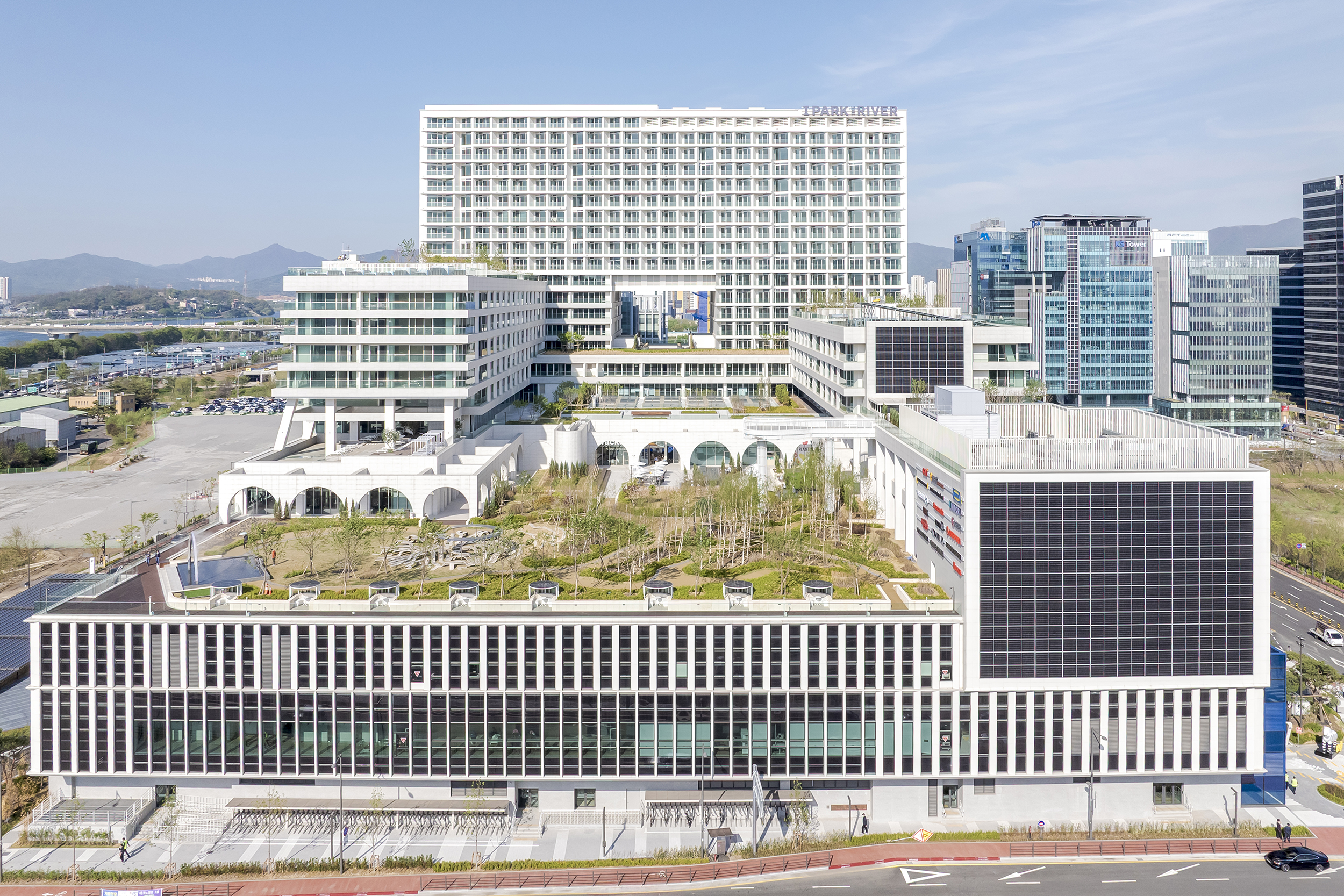
Godeok iPark The River after completion (Source: JK Mirae)
THE SHIFT
A few weeks later, they actually came back and asked me to help reimagine the overall spatial concept, not just the gallery section, as the existing interior plan that was drafted a decade ago now felt outdated.
I was hesitant at first because I am not an architect or interior designer. Still, I reminded myself that I spent years curating spatial experiences through exhibitions with a focus on flow and aesthetics while absorbing global examples from numerous passionate architect friends. So, with the hope of contributing my insight in the best possible way, I said, “YES!”
It would be foolish to promise more than what I can deliver with confidence, so, rather than taking over the design, I proposed creating a spatial guideline to harmonize all elements of this complex. This marked the beginning of a six-month consulting journey.
DIAGNOSIS
The existing plan was full of ambition with keywords like “young & funky,” “virtual,” “modern classic, “and “smart life.” Led by three themes of “warm,” “bright,” and “active,” LED screens dominated the layout, chasing a sense of newness. It featured various contents that were considered the most fashionable at the time to stimulate visitors with dynamism.
ISSUES
The project offers plenty of variety, but it wasn’t clear that this actually makes people want to experience the space. This complex comprises five floors of underground parking, five floors of commercial space, a food court, an outdoor park, a community space, and 12 floors of officetels. It’s a mix of functions, so it was crucial to have them converge into a single narrative to feel cohesive.
Numerous LED screens were more likely to cause fatigue than create a welcoming ambiance. It was also evident that the operation would be overwhelming with such diverse programs for each function. Once the operators burn out, visitors will naturally drift away. As a complete redesign wasn’t possible because the structure and exterior were already far along, what was needed was a reset at the core: a clearer sense of priorities and direction to align the aesthetic and functional narratives of the interior.
Chasing ‘Newness’ can never transcend time. Despite best intentions, it might soon feel outdated, just as it had in a decade.
Before offering solutions, I went through the following steps to clarify the client’s intentions:
1. Clarifying Core Values
I aggregated various keywords into the following four to define the client’s needs.
“Ahead of its time”: The client wanted a futuristic vision, as it was a new development.
“Modern classic”: A balance of refinement and longevity.
“Artsy”: Daily inspiration and creativity for all visitors and residents.
“Scenic”: Making full use of the Han River and Godeok Bridge views.
2. Key References Analysis
JK Mirae had two main inspirations: De Depot in Rotterdam and Bikini Berlin.
De Depot: It’s a museum with MVRDV’s unique, sensible design, offering accessibility and transparency by making 99% of its collection visible. (which is remarkable, considering that the British Museum’s rate is around 1%) It was for active viewer participation over rigid curation, allowing artists to take on the site more like a canvas.
Bikini Berlin: The commercial complex transformed a 19th-century shopping district into a fluid, future-forward experience, rooted in coexistence with its environment, particularly the Zoological Garden. It aims to provide a lifestyle that allows the spirit of the complex to prevail, avoiding overpowering content.
I then defined the demographic of the visitors to these two references.
Families, cultural seekers, and various creatives who stay curious to try the new, while valuing sustainability, harmony, and cooperation.
And defined the target demographic of this project accordingly.
20s–50s middle-to-high income urbanites seeking fresh inspiration and daily comfort.
After these steps, I could evidently see how to bridge the gap between what JK Mirae wants and the shortcomings of the current planning, which led us to establish the following values.
Spacious
Spatial characteristic: The embodiment of totality
Fully utilizing the surrounding height of max 23m and grandeur of 300,000 square meters, where all can visit with comfort.
Inspirational
Provide a platform: Inspire, not shout
A platform that amplifies the individuality of all visitors and stores.
Timeless
Harmonious beauty: Nature-like
Pursuit of natural and essential values, as natural elegance doesn’t fade.
PROPOSAL
Spacious, Inspirational, Timeless – what could encompass all these values? The answer came through phrases of Il Si Mu Si Il (일시무시일) and Il Jong Mu Jong Il (일종무종일).
Core Philosophy
Il Si Mu Si Il (“One begins with no beginning, and returns to One”) and Il Jong Mu Jong Il (“One ends with no end, and returns to One”) are phrases from the Cheonbu-gyeong, an ancient Korean text that encapsulates our ancestors’ philosophical observations of cosmic movement.
These express the idea that all changes in the phenomenal world are rooted in the One, and the One is, at its essence, emptiness. By harmonizing emptiness, oneness, and their expressions, the true human stands fully in the present, realizing growth through every moment of life.
This interpretation led me to understand emptiness not as a void, but as a state poised to embrace the totality of the One. When emptiness and the One flow in harmony, a space for perpetual growth and expansion is created, with an ethos that reflects this infinitely shifting ecosystem and its dynamic interplay. Timeless beauty can emerge through the circulation and continuation of diverse inspiration while circulating essential values across time.
This idea also connects to one of East Asia’s foundational cosmologies: CheonWonJiBang (천원지방).
Related Element: CheonWonJiBang (천원지방)
CheonWonJiBang(“Heaven as a circle, Earth as a square”) is a traditional East Asian cosmology that conveys the idea that “humans symbolize the realization of the ideals of Heaven and Earth.” To carry the principles of Heaven (○) to Earth (□), the Cheonbu-gyeong was written in the form of a structural square. When the circle and the square are placed at the center, the three points of intersection form an equilateral triangle (△), which defines the concept of Won-Bang-Gak (circle–square–triangle) as follows.
Circle (ㅇ / Heaven): A continuous line with no beginning or end, representing the absolute truth and universal laws.
Square (ㅁ / Earth): Four straight lines symbolize the four natural elements —Earth, Water, Fire, and Wind — each representing birth, growth, maturation, and transformation.
Triangle (△ / Human): Three lines represent a person composed of the mind, thought, and will. As the word human (사람) is a conjugation of life (삶) and knowledge (앎), it symbolizes humans as a being that learns through living.
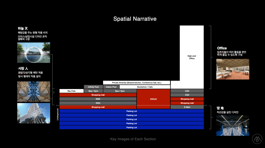
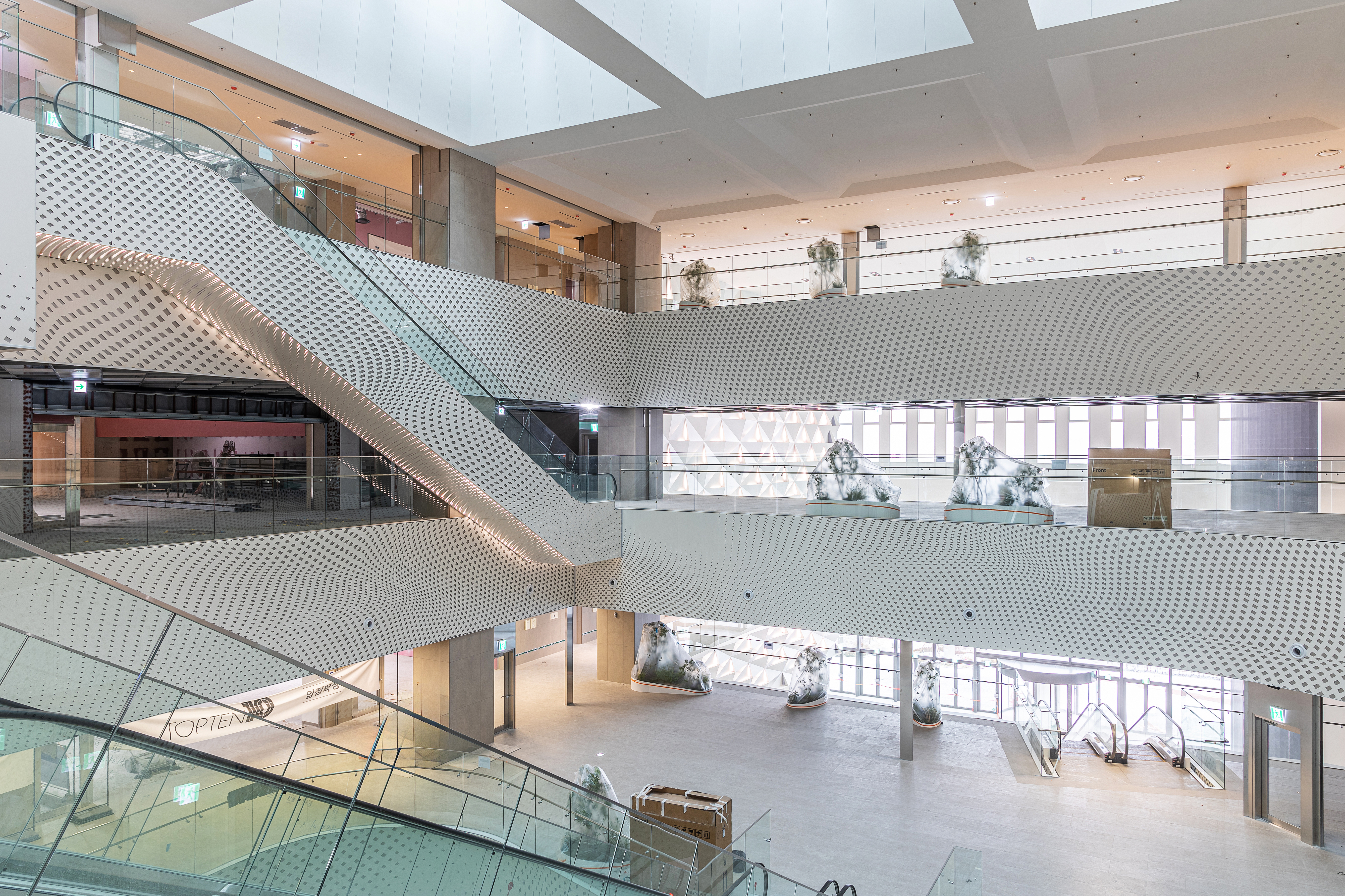
From this philosophical foundation, the underground parking took on square forms and linearity (ㅁ), the main commercial areas for people used triangles and radiating patterns (△), and the rooftop spaces that face the sky emphasized circular forms (ㅇ). Colors were assigned accordingly, with the underground using deep blues for mass and stability, human/commercial areas featuring diverse, vibrant hues to reflect transformation, and heaven, represented by whites and golds to express origin and liberation.
RESULTS
1. Design
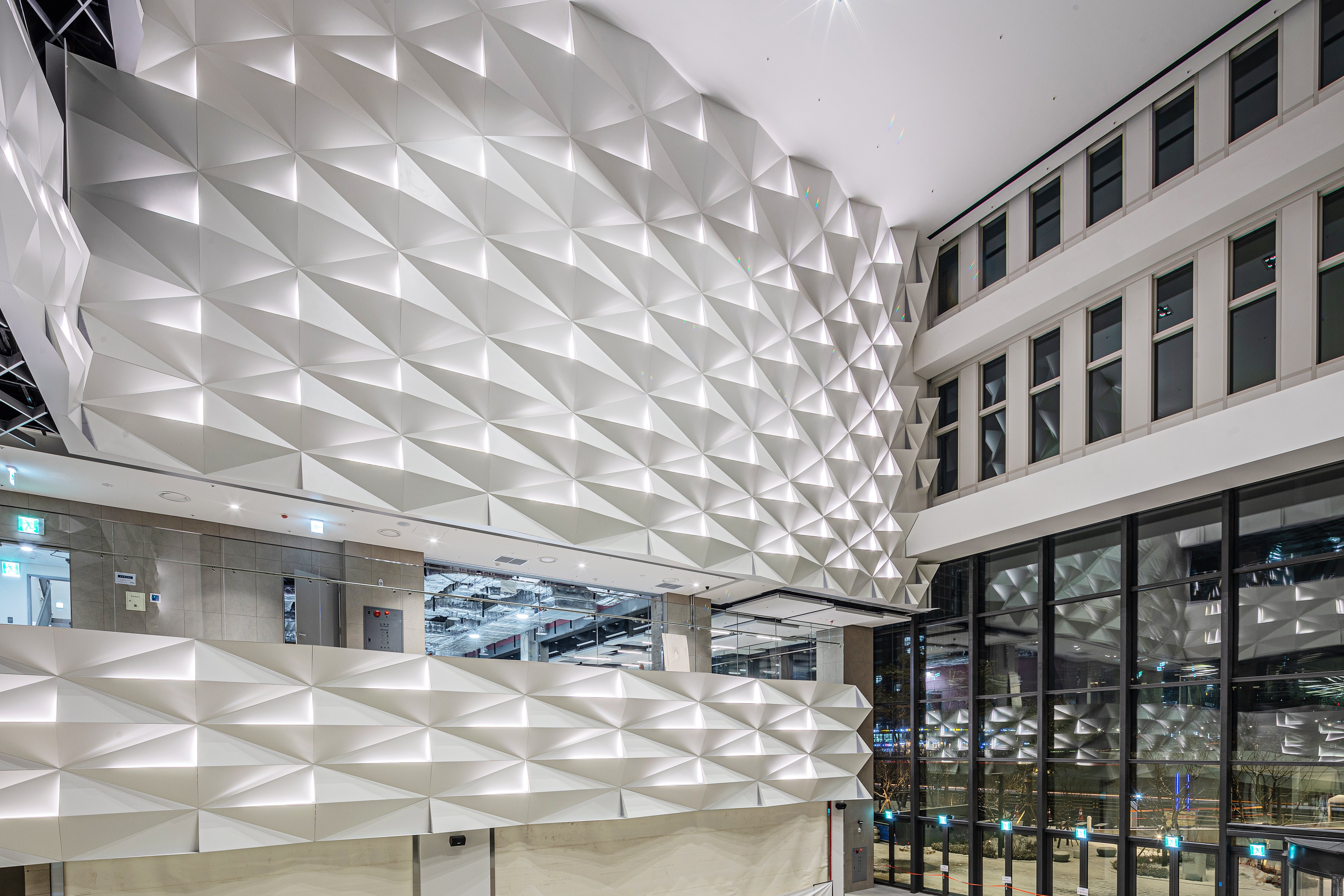
Entrance Façade Pattern: The entrance façade is a crucial element in creating the initial impression of a commercial space. We thus developed the pattern with triangle variations to represent the visitors and brands, the true protagonists of the space, following the symbolism we took on from CheonWonJiBang.
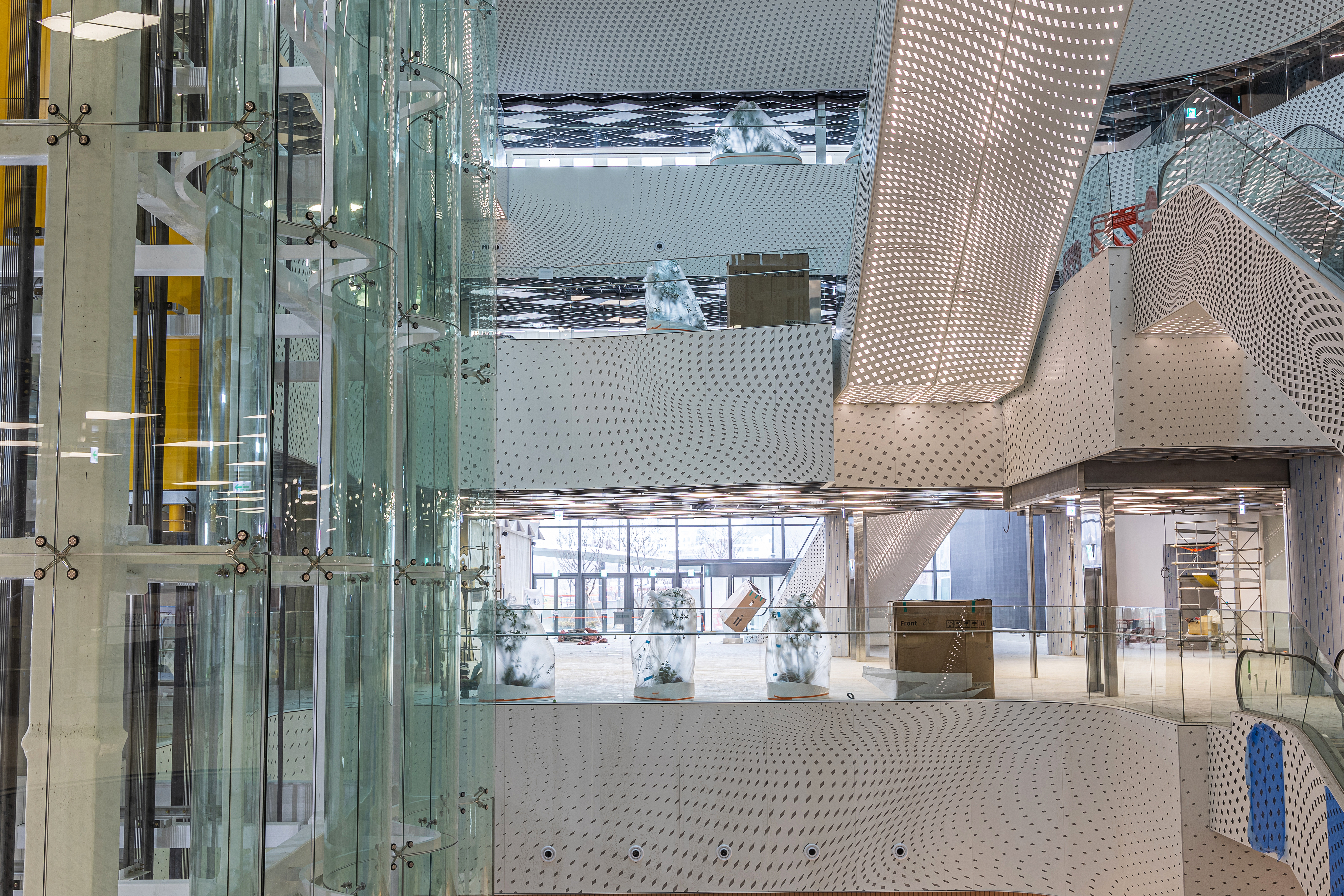
Commercial Façade Pattern: We initially intended to use the same pattern above throughout the commercial façade, but budget and construction constraints led us to adjust the design. We shifted to a flowing, wave-like pattern of triangles and rectangles, introducing a subtle movement to the space while minimizing distraction from the bustling mall scene. A Halftone Net Pattern derived from Won-Bang-Gak was punched into stainless steel with internal lighting for a soft shimmer.
Media Façade: I suggested aggregating the media facades originally planned for various facades onto one side to create a more powerful and immersive experience. This would also be ideal for performances by media artists, brand events, and high-impact visual advertising.
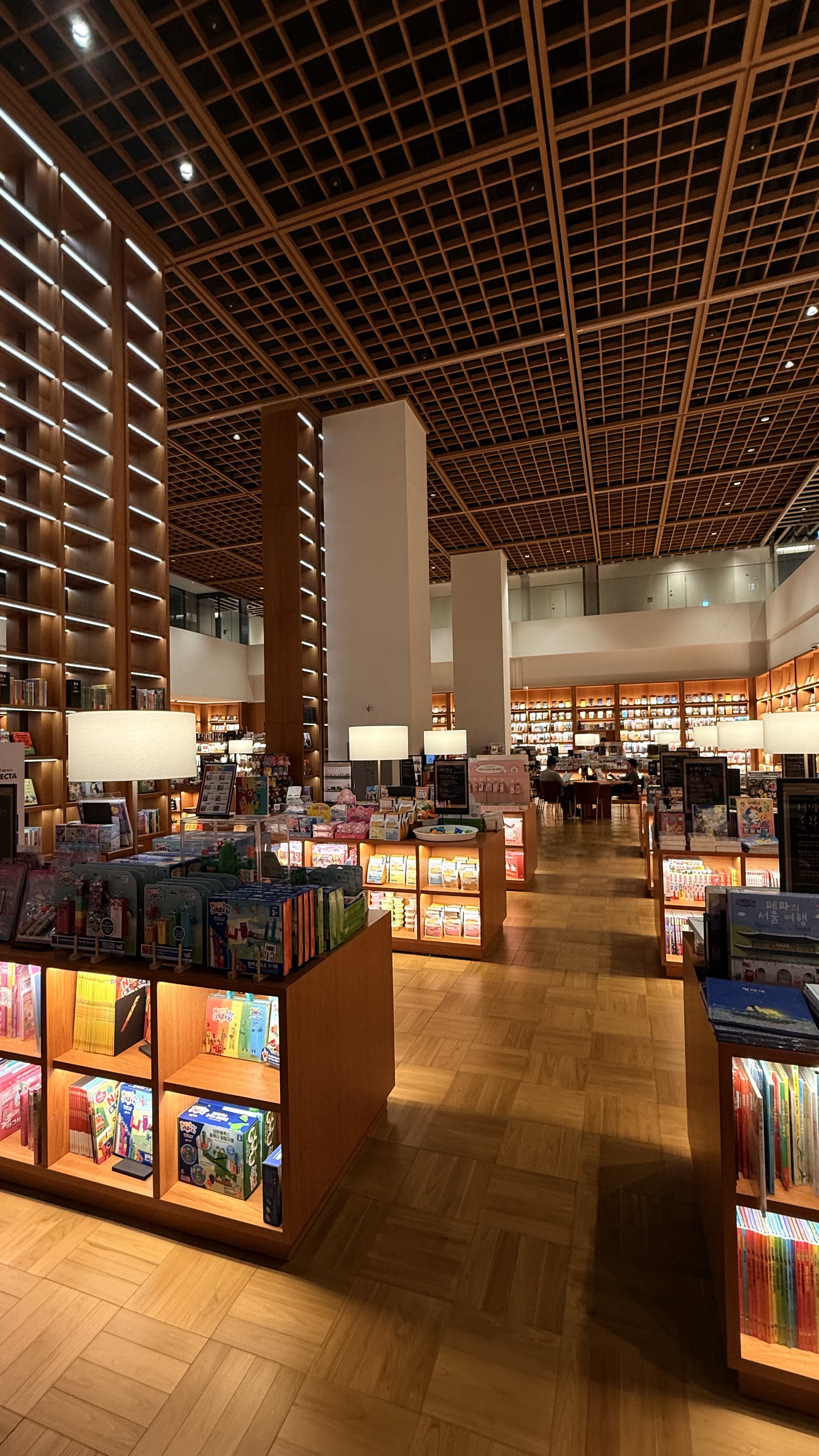
Hinoki Wood: Due to eco-friendly building certification requirements, we were required to use a substantial amount of hinoki wood. It was initially planned for common areas, but we found it was not suitable for the energy of a bustling commercial space. Instead, we used hinoki at the 5th-floor library for visitors to experience its warmth and elegance through physical touch.
Indoor/Outdoor Gardens: We aimed for calm landscaping that complements the surroundings and provides rest areas. For the indoor garden, maintenance was the biggest concern, so we suggested low-maintenance designs, such as moss or zen gardens that still maximize aesthetic value.
Additional Elements: We also provided detailed guidance on exterior wall colors, ceiling patterns, flooring materials, lighting, rooftop arches, bridge undersides, windbreak rooms, entrances by floor, common areas, kiosk locations, nursing rooms, family lounges, stroller rental stations, resting areas, conference rooms, restrooms, elevator design, rooftop gardens, and other shared facilities, overseen meticulously from planning to construction by designer Dahyun Cho.
2. Artwork Curation: In line with the philosophy that guided the interior design, the artworks were selected to become one with the space while leaving a lasting impression on visitors. Thanks to an incredible collaboration with The Ton, a Seoul-based firm specializing in public art selection and installation, the commissioning and production process went seamlessly. I am especially grateful to CEO RR for introducing us to this team.
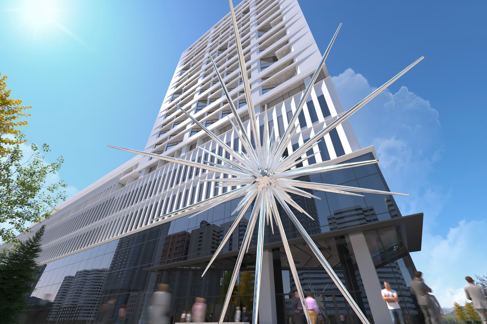
Installed at the main outdoor entrance, this piece turns the concept of “radiation,” symbolizing people in Won-Bang-Gak theory, into a star-shaped sculpture that establishes the conceptual clarity of the space. It was an honor to collaborate with Choi Jeong Hwa, a leading figure in Korean public and contemporary art, on this newly commissioned piece.
Made of chrome for easy maintenance, the sculpture emits a gentle glow from its center at night, becoming an iconic landmark in the area.
“Shimmering with brilliant silver light, the piece provisionally titled STAR fills the space with radiance. Its multiple forms capture the dispersal of natural light in every direction, symbolizing hope, aspiration, and passion. Here, light serves simultaneously as motif, material, and technique, extending Choi’s practice of rearranging everyday objects into new configurations. The work’s dazzling form offers fresh vitality and inspiration to the space, while also evoking the natural brilliance encountered in daily life.”
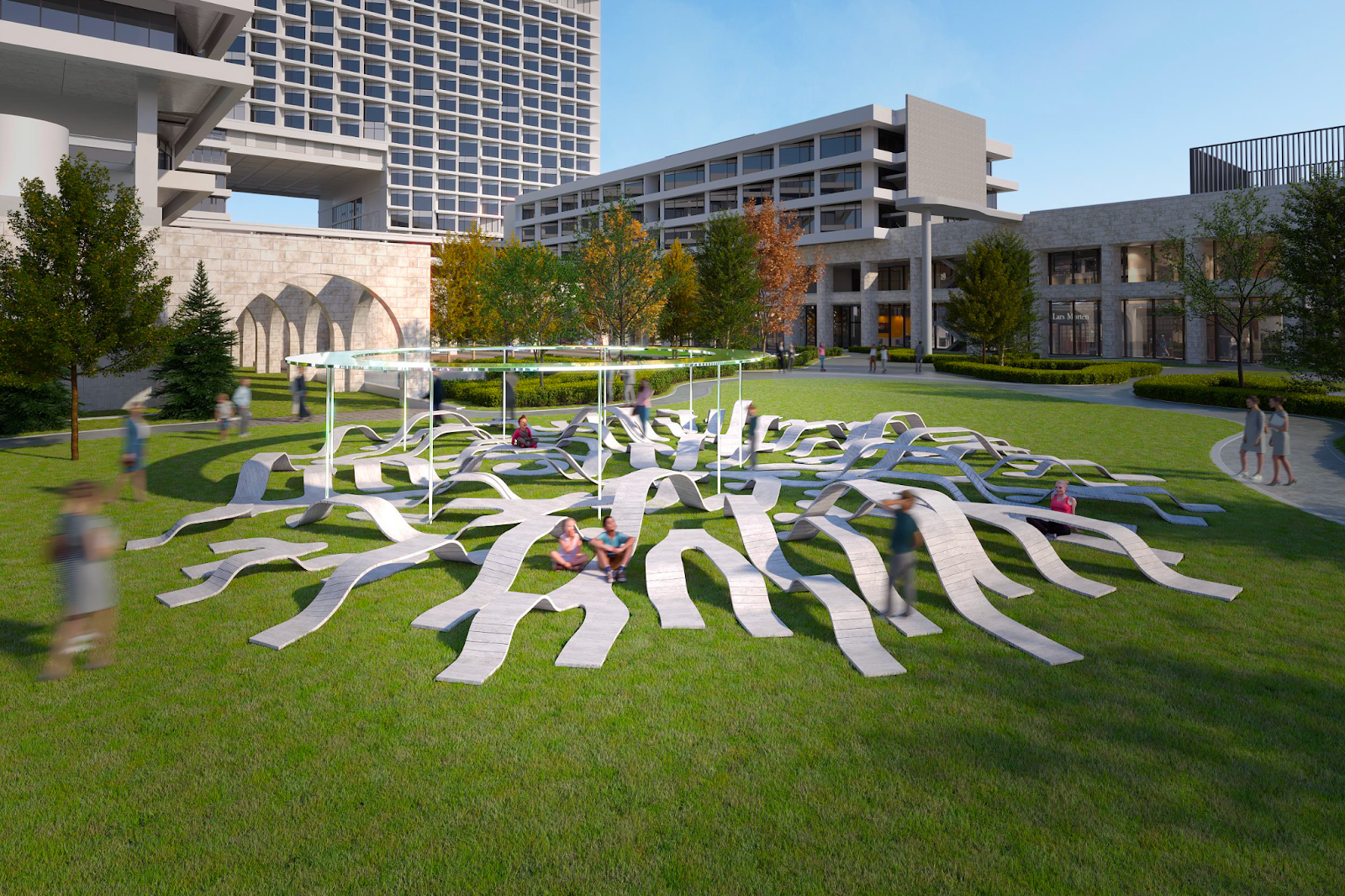
Lee Yong Ju: ROOT BENCH
Resonating deeply with the Won–Bang–Gak diagrammatic pattern of the design concept, ROOT BENCH was an ideal fit for the site. It invites people to sit comfortably and enjoy nature, as it did for Ichon Hangang Park, which was cherished by many. Its circular shade echoes with the symbol of heaven and provides a more restful place to pause.
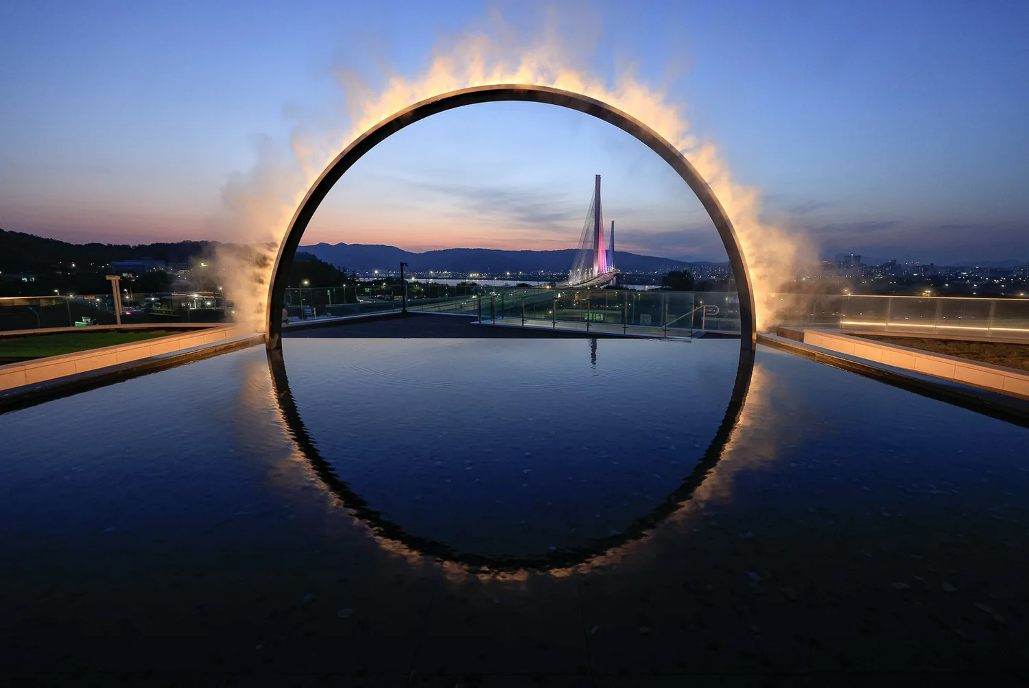
James Tapscott: Arc ZERO
This work, a winner of LIT Lighting Design Awards, provides a direct and intuitive representation of the circle as a symbol of heaven. It welcomes visitors to walk through and make a memorable moment for themselves with the artwork while fully enjoying the view of the Han River and the Godeok Bridge. The piece also serves as a visible symbol of the venue, as it can be seen from the passing cars on the Olympic-daero. To prevent damage in cold weather, hot water circulation and heating cables were implemented.
In line with the concept of providing a landscape/platform, this piece was installed across three sides of the DA. The left side aligns with the building’s boundary and continues the design from the original artwork. Each unit is fixed at different angles, allowing wind to pass through and creating dynamic shadows that visually connect to the front units.
Media façades: Park Je-sung and oOps.50656
The atrium’s large façade and the central elevator media wall of the complex feature works that symbolize the harmony and circulation of nature and humanity.
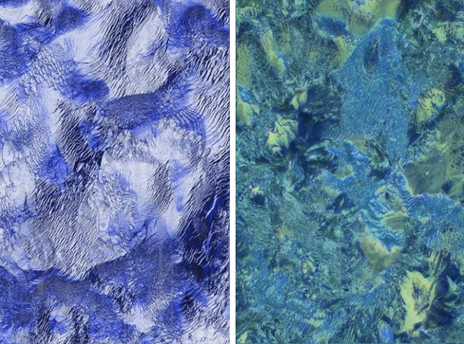
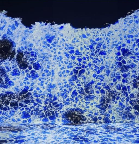
Sunjeong Hwang and Gyuchul Moon, both active in Korea and Europe, established a collective to unravel the beauty and philosophies of nature with their algorithmithmic AV works. Their works provide moments of beauty and respite amid the visual noise of advertising in the space. Park Je-sung’s works also naturally came to mind for their ability to articulate cosmic and natural narratives within the digital screen.
*Other curated content for broader audiences was selected by The Ton. The current images are reference materials from their earlier works, with documentation of the installed pieces to be updated soon.
Bookstore Installations
The cozy yet refined bookstore showcases works by Cha Seungeon and Park Rondi, both of which resonate with the spatial atmosphere.
Cha Seungeon, known for weaving and dyeing practices that reflect on the passing of time, offers works that perfectly complement the bookstore’s contemplative setting. It provides a counterpoint to the bustle from the surrounding commercial facilities.
Rondi addresses the many desires and contradictions of capitalist society. Rather than dwelling solely on its negative aspects, the artist employs humor, cuteness, and vulnerability to instigate more genuine dialogues and observations.
All works are acquisitions, so I carefully selected ones that could satisfy both cultural and investment value.
In the end, what was expected to be a six-month consulting project turned into a nearly two-year-long consultation. I terribly regret that I could not oversee it through to completion as I had to leave for studies in the UK, but I extend my gratitude once again to designer Dahyun, who took over the responsibility on site through to construction, and above all, my sincere respect and appreciation to JK Mirae for uniting all partners in harmony with the heartfelt intent of offering visitors a truly meaningful experience.